Kingfisher Radler
Through the initial part of the pandemic and lockdown, when the youth of the country voiced their need for a fresh start, we heard them loud and clear. The people were looking for a change from old patterns; a drink that could work in tandem with their need to ‘Hit Refresh’!
Introducing the all-new Kingfisher Radler, a vibrant, refreshing new non-alcoholic drink that speaks to a generation that craves a new identity and experiences that are not defining; a generation that’s beginning to eke out a new world of limitless possibilities.
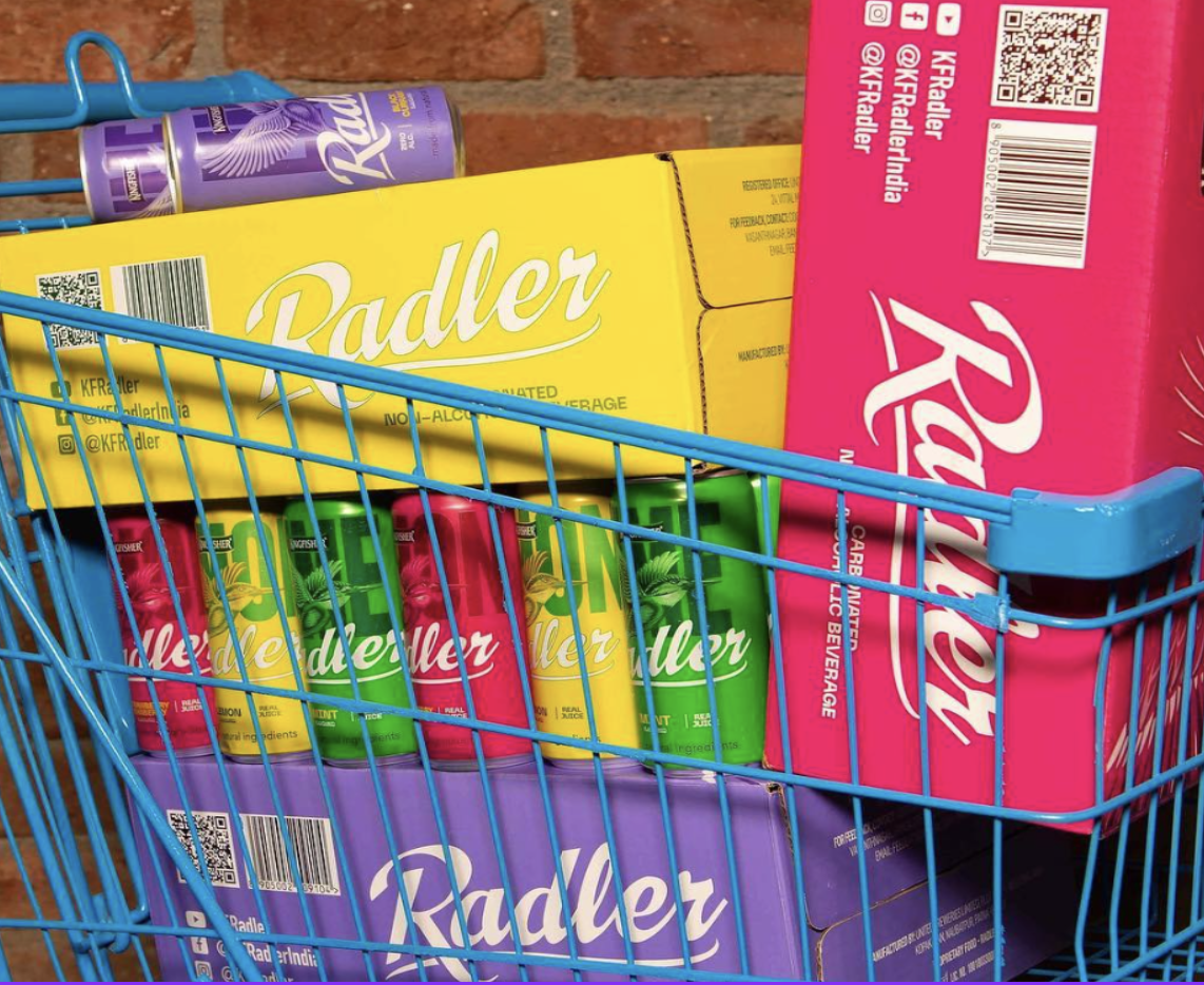
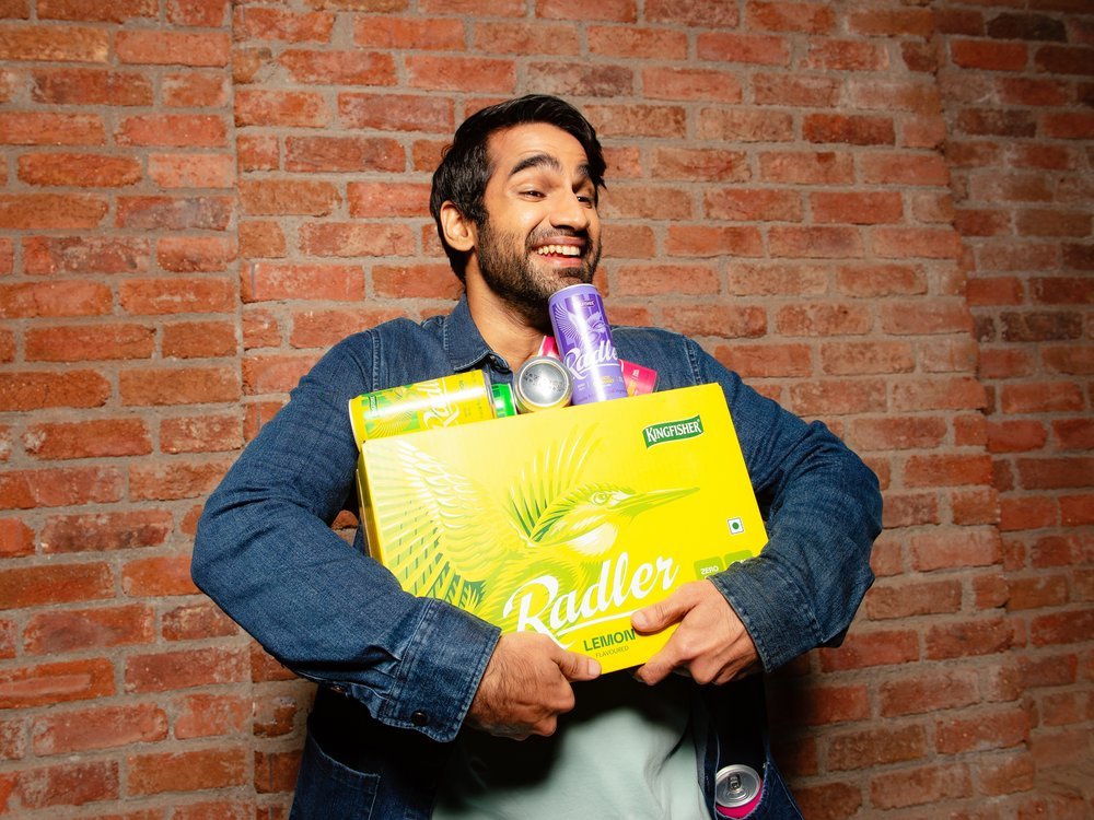
PACKAGING DESIGN
Good product packaging design is the first tangible experience the customer has with a brand. The aim was to create a compelling design to turn millenials and Gen Z into advocates and refresh the Kingfisher Brand. The four variants display bold colour & typography & position the brand logo as a modern element by borrowing from the heritage & nostalgia of the Kingfisher Brand and building into the next generation.


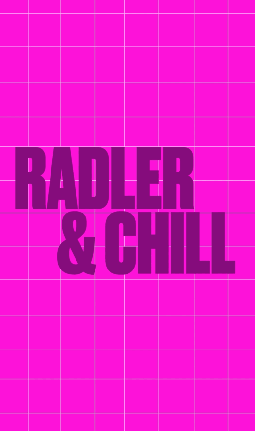
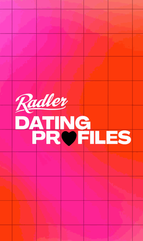
PLATFORM & BRAND NARRATIVE
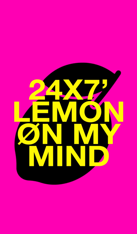
With an all new communication, ‘Hit Refresh’ - and an all brand new digital first communication strategy with an instagram first play, this brand showed the next generation of gen z and millennial consumer a never-seen-before vibrancy; one that paid attention to their needs and motivations and resonated with their own world views at a time where few others were doing so.


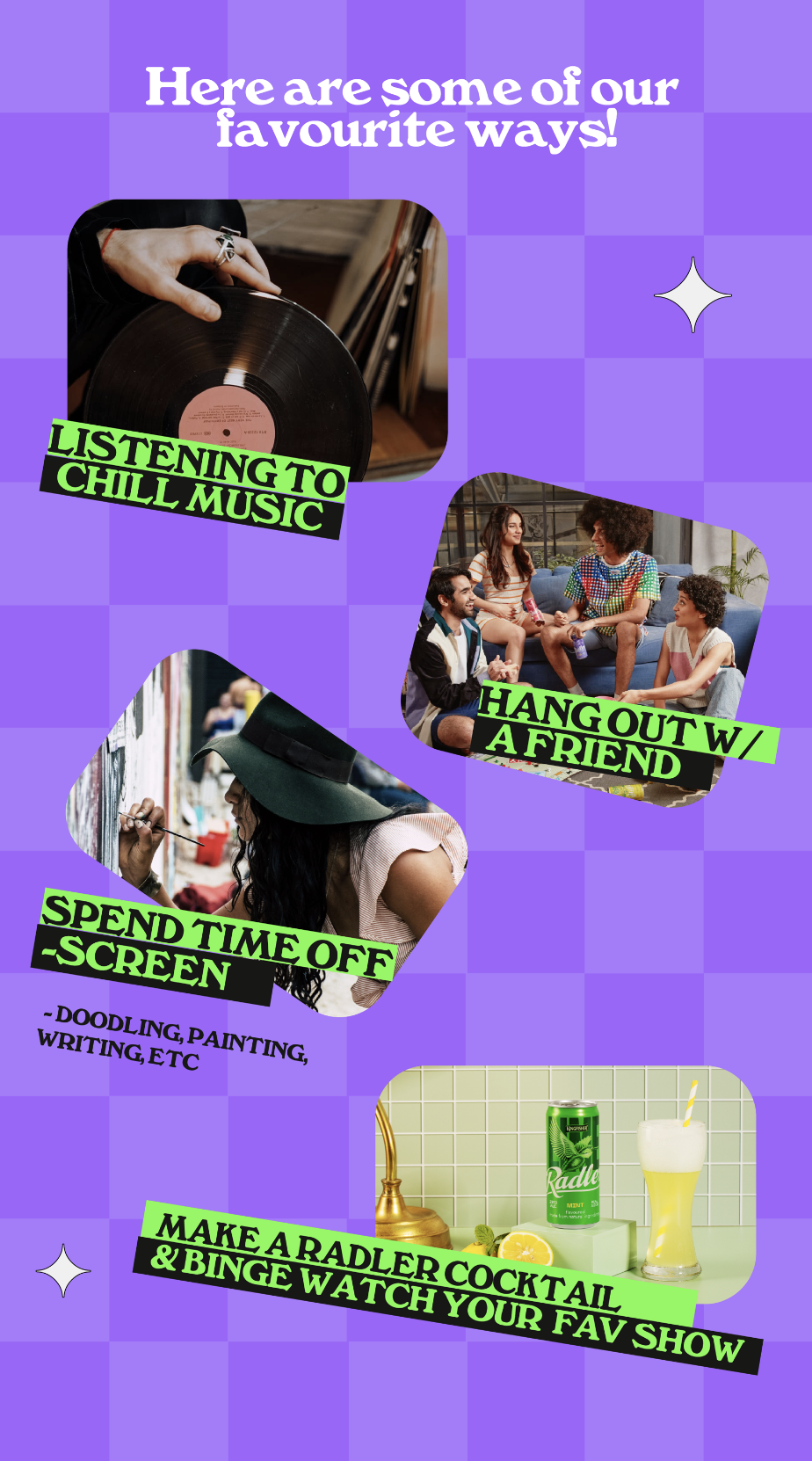


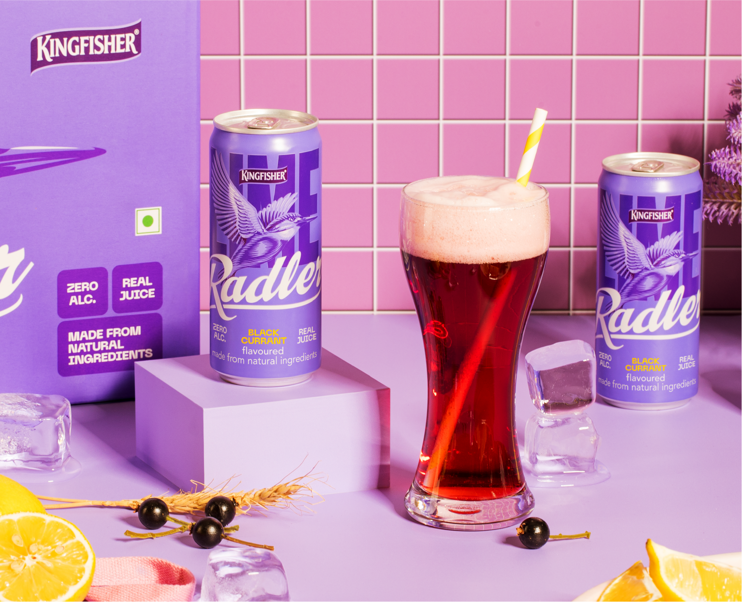
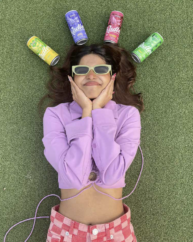
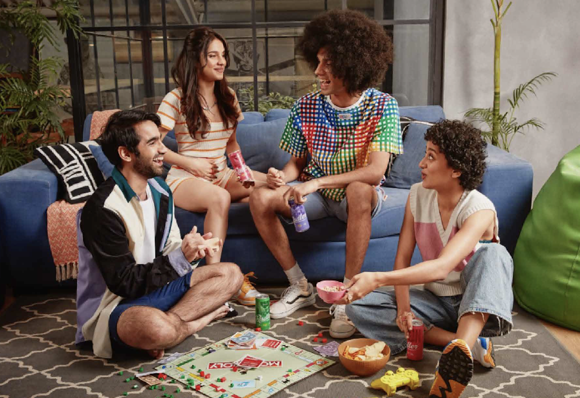
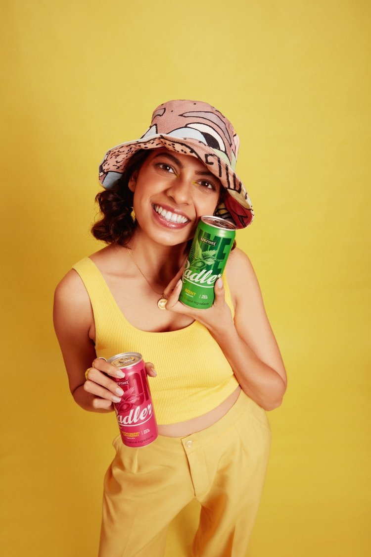
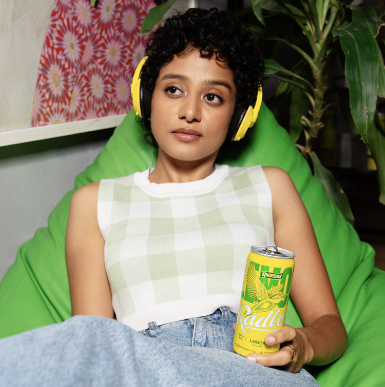
PRODUCT & LIFESTYLE SHOOT
THE PRODUCT & LIFESTYLE SHOOT ELEVATED THE KINGFISHER RADLER REBRAND IN A FUN, PLAYFUL & VIBRANT WAY - BRINGING TO LIFE THE DIFFERENT LIFESTYLE CUES THAT THE BRAND REPRESENTS & ‘HIT REFRESH’ TAGLINE.


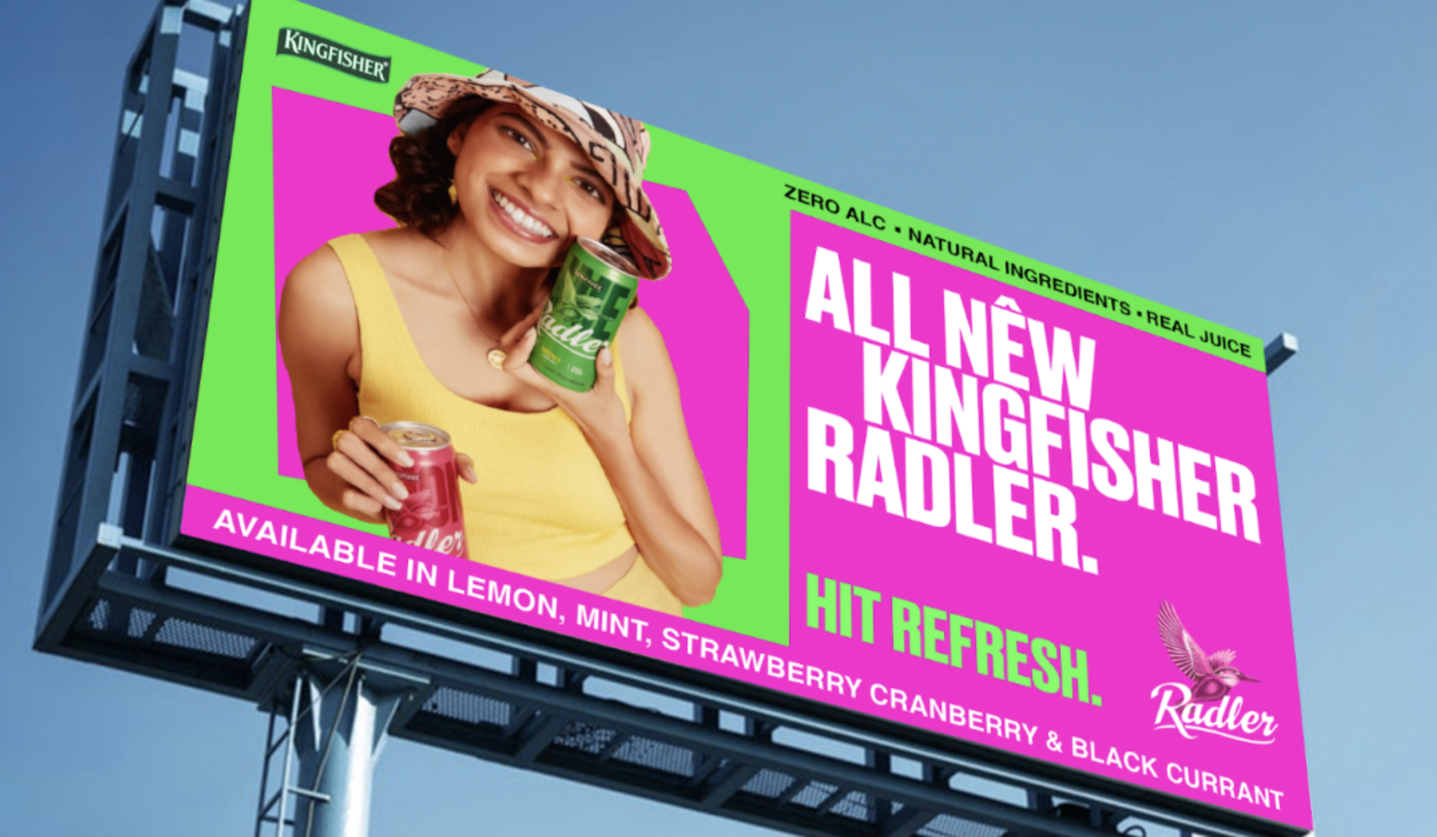
OUTDOOR ADVERTISING (OOH)
ADVERTISING ACROSS VARIOUS INDIAN CITIES SUCH AS GUJARAT & KERELA.